Brand Photography Style Guide: What to Put In and How to Write It
A brand photography style guide is a short, practical document that tells anyone who shoots, edits or chooses images for you what your pictures should look and feel like, and what they should never do. Done well, it fits on a few pages, it is written in plain words, and a photographer you have never met can pick it up and understand you in ten minutes.
We match brands with queer photographers every week, so we see what happens when that document exists and when it doesn’t. This guide covers what to include, how to write each part, and the parts most guides skip: consent, licensing and who is actually in your pictures.
TL;DR
- A good guide covers light, colour, composition, subjects, locations, editing and a clear “never” list, each illustrated with real example images.
- Write it as rules plus reasons. “Natural light” is a rule; “because our members trust what looks unstaged” is the reason that lets a photographer make good calls.
- Record consent and licence terms alongside the visuals. In the UK, photographers generally own the copyright, and images of identifiable people are personal data.
- For LGBTQ+ audiences, commission original work and show people all year, not only in June.
- Review the guide after every shoot. It should change as your brand does.
Table of Contents
- What a photography style guide is actually for
- Start with the feeling, then the rules
- The sections your guide needs
- Authentic or stock: make the call in writing
- Writing the LGBTQ+ section of your guide
- Consent, copyright and licences: the legal page of your guide
- A worked example: a small community organisation
- Build your guide in six steps
- When to commission, and how we can help
- Keeping the guide alive
- FAQ
- Sources
What a photography style guide is actually for
Your logo and colours are probably already written down. Photography is usually the part that stays in someone’s head, which is why a website ends up with five different looks: a warm candid on the homepage, a cold studio headshot on the team page, and a stock image of strangers laughing at a salad.
The guide solves three problems:
- Consistency. Different photographers, different months, one recognisable world.
- Speed. Fewer revision rounds, because the brief answers the questions before they are asked.
- Judgement. Your marketing team, your agency and your freelancers can all choose images the same way.
The Office for National Statistics publishes its own photography brand guidelines openly, which is a useful example of how much an organisation can say in a short, usable page. Shelter’s imagery framework is another: it says photography should tell people’s stories, capture authentic moments and feel intimate. Neither is a glossy brand book. Both are working documents.
Start with the feeling, then the rules
Before you write a single technical instruction, decide what a viewer should feel. Pick three or four words and make them specific. “Friendly” could mean anything. “The flat as you arranged it, a friend taking the picture” tells a photographer something.
Shelter’s framework goes further and uses art direction cues, for example how a camera angle or lighting choice can help an image feel welcoming rather than provocative. That is the right instinct: turn each personality word into something a photographer can physically do.
| Brand word | What it means on set |
|---|---|
| Warm | Window light, golden-hour exteriors, subjects at ease, eye-level framing |
| Bold | Strong colour, direct eye contact, tighter crops, confident poses |
| Honest | Unretouched skin, real workspaces, no staged laughter |
| Playful | Movement, candid mid-sentence moments, unexpected locations |
If you cannot connect a word to a decision on set, cut the word.
The sections your guide needs
Light and mood
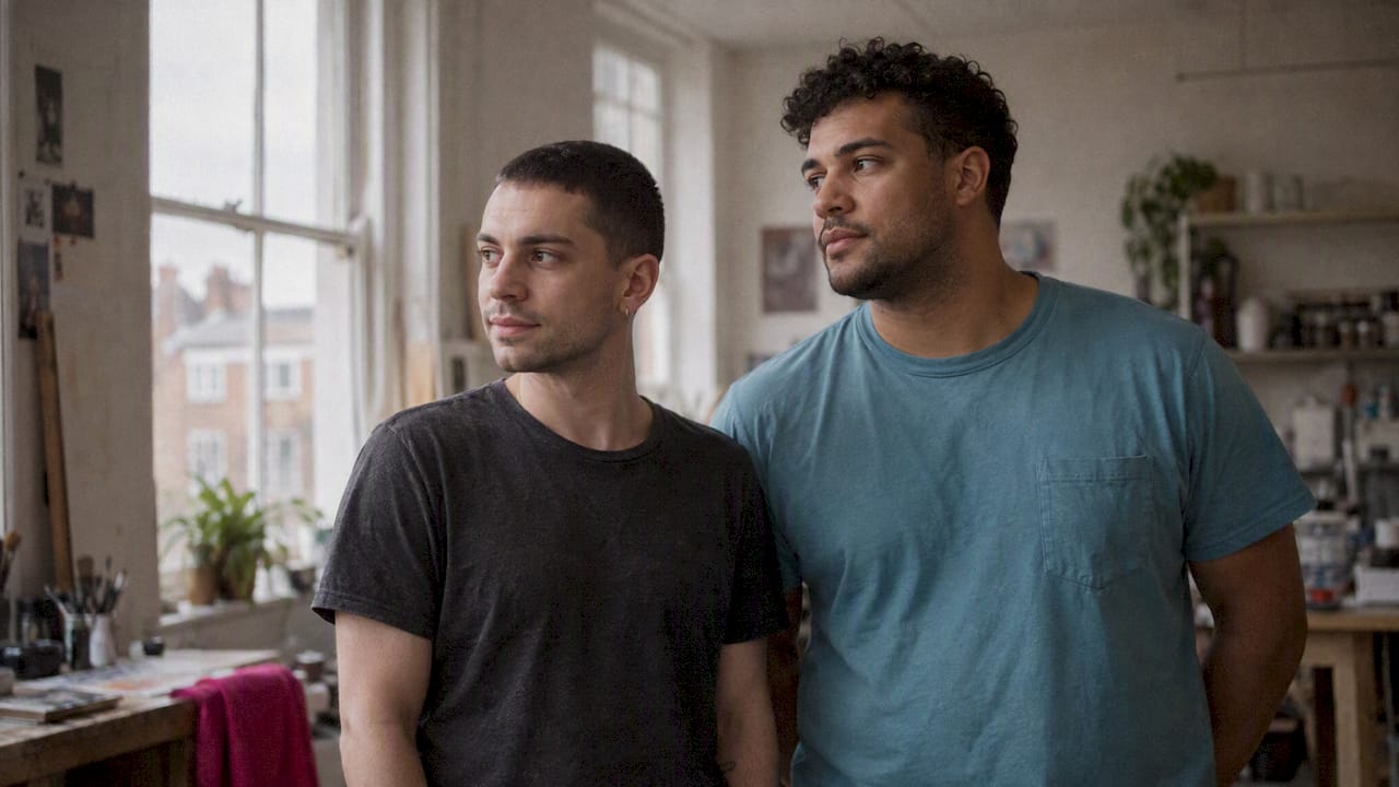
State whether you want natural light, soft studio light or dramatic contrast, and whether images should be bright and airy or deep and saturated. Add the times of day and kinds of window you prefer. Natural, ambient light is the usual route for brands that want images to feel like real life rather than a set.
Colour and tone
Do not just paste hex codes. Describe how photographs should sit beside your palette: warm or cool skin tones, how much saturation, whether backgrounds should echo brand colours or stay neutral. Include a note on black and white, and when it is acceptable.
Composition and framing
Say how much space you need for text overlays, whether you prefer wide environmental shots or close portraits, and which angles are off limits. Give the ratios you publish in: 16:9 for web banners, 4:5 for social feeds, 9:16 for stories and short video. If vertical video matters to you, our workflow note on a production-ready 9:16 master shows how to plan for it before the shoot.
Subjects and people
This is where most guides are thinnest and where the most damage is done. Describe who appears in your pictures and how. Are they real customers, team members, collaborators? How are they credited? What does a natural pose look like, and what feels staged?
Then check your own audience against your own imagery. The Representative Media best practice guidance offers questions to ask at each stage of the creative process to encourage more representative content, and it is a good prompt for an honest audit: who is missing from our pictures who is in our audience?
Locations and props
List the kinds of places that feel like you: a community venue, a kitchen table, a studio with a particular wall. Note any that are out of bounds, such as a client’s private home unless agreed in advance. If you want real spaces rather than rented sets, say so.
Editing and retouching
Define how far edits go. Skin retouching, body reshaping and heavy colour grading are choices, not defaults. For many queer clients, one line matters a great deal: no editing that changes someone’s body, face or gender presentation without their say. Put it in writing.
Technical delivery
Specify file formats, colour space, resolution and naming conventions, and agree them with your photographer before the shoot rather than after. Your largest planned use sets the minimum: a picture that looks fine on a phone can fall apart on a pull-up banner. If you print large formats, a practical read is this guide to banner design and print sizing, which shows how viewing distance shapes what you need to ask for.
The “never” list
The shortest section and often the most useful. Examples: no rainbow-filter overlays, no cropped faces to make a crowd look bigger, no stock images of “diverse” groups who have nothing to do with us, no AI-generated people.
Authentic or stock: make the call in writing
Stock is fast, and sometimes sensible for abstract backgrounds. For people, it is a trap. The people in it are rarely your people, and your audience can usually tell.
The Outvertising advocacy playbook, published with the Conscious Advertising Network, argues that advertisers have a responsibility to represent the LGBTQIA+ community authentically. In practice that means commissioning rather than searching. Your guide should say plainly where stock is allowed (textures, objects, landscapes) and where it is not (anyone presented as a customer, member or colleague).
Our own position is simple: everything we deliver is original, never stock and never AI-generated. If that is also your rule, write it down so your next agency cannot quietly break it.
Writing the LGBTQ+ section of your guide
If you want to reach queer audiences, this part deserves its own page. Three principles hold up.
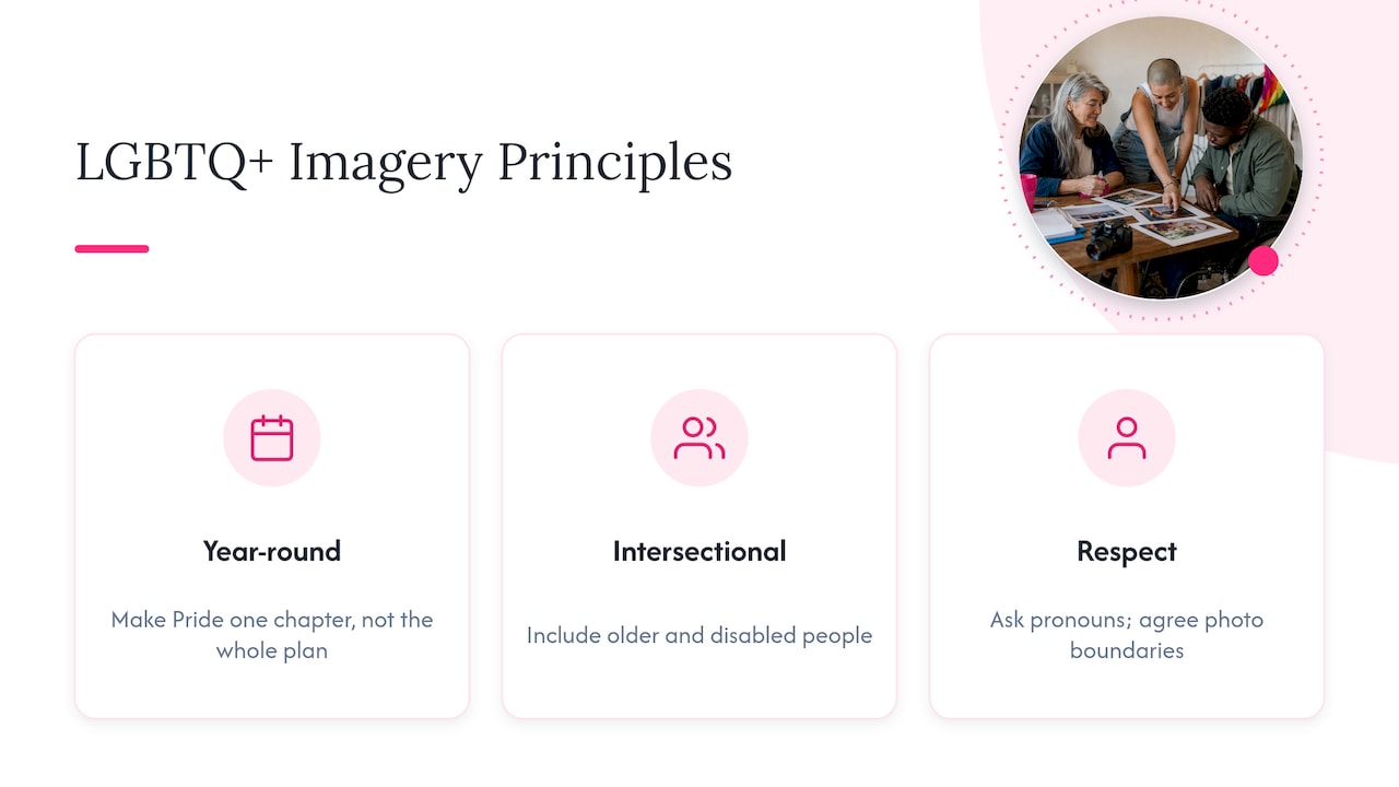
Show people all year. GLAAD and Getty Images developed contributor guidelines for visual representation of the transgender community, and the wider LGBTQ+ visual storytelling guidebook from the Unstereotype Alliance builds on it. Both encourage thoughtful, varied, non-stereotyped images. A brand that only appears in June reads as a brand that only shows up in June. Your guide should set out a year-round image plan, with Pride as one chapter rather than the whole book. If Pride is part of your calendar, see how we approach Pride campaign photography in London.
Be intersectional. Queer people are also older, disabled, Black, brown, working class, religious, parents. Write that into your subject guidance. The Representative Media guidance specifically flags groups that are often overlooked in imagery, such as older people and disabled people.
Respect names, pronouns and boundaries. Ask for pronouns before the shoot and record them. Agree what is comfortable to photograph, what is not, and how captions will name people. Give photographers credit. None of this is a style choice. It is what makes people willing to be photographed twice.
Consent, copyright and licences: the legal page of your guide
This section is not decoration. It is what protects you and the people in your pictures.
Consent for people in your images
A photograph of someone who can be identified is personal data under UK data protection law. The Information Commissioner’s rules need a lawful basis for using it, and for brand work that is very often consent. The government’s own guidance on taking and using photos and videos in schools explains the principle in a setting many people know: images of identifiable people are personal data. Your business is not a school, so treat it as an illustration and take advice on your own situation.
Practically, your guide should say:
- consent is written, not verbal;
- it records who agreed, when, and for which uses;
- people can withdraw it, and you know how you would stop using their image.
The last point matters more for queer subjects than for most. Someone may be out at a shoot and not at their workplace next year. Build a withdrawal process before you need one.
Copyright and licences
Under UK law, the creator of a photograph is generally its first owner, and being commissioned does not automatically transfer that. The Intellectual Property Office’s blog on copyright and GDPR for photographers is a good starting point, and GOV.UK states plainly that you cannot use copyright material without permission.
So your guide should list the terms agreed for each shoot: where images may appear, for how long, in which territories, whether edits are allowed, and how the photographer is credited. We set out the five terms we suggest recording in image usage rights in the UK. If you are unsure about a contract, a solicitor who works with creative businesses can check it.
A worked example: a small community organisation
Imagine a London LGBTQ+ charity with a volunteer who takes the photos and a website that looks different on every page. Their one-page guide might read:
- Feeling: warm, direct, unpolished. People look like themselves on a good day.
- Light: natural, indoors near windows, no flash.
- Subjects: real volunteers and service users who have signed written consent for named uses. Mix of ages, bodies and genders. Captions use names and pronouns people chose.
- Places: the community centre, local streets, members’ choice of location.
- Never: rainbow overlays, stock “diverse groups”, crops that remove faces to hide who attended.
- Editing: colour and exposure only. No reshaping.
- Delivery: web-ready JPEGs plus full-size originals, naming by date and event.
- Rights: licence term and credit line noted in a shared spreadsheet.
That is a page and a half, and it would improve every photograph they commission next year.
Build your guide in six steps
- Audit what you have. Print your last fifty published images. Group them. Which ones feel like you, and which feel borrowed?
- Choose your three feeling words and translate each into on-set decisions.
- Collect references. Six to ten images from your own work, plus a few from elsewhere, each labelled with why it works.
- Draft the rules under the headings above. One line each, with a reason.
- Add the legal page: consent process, licence terms, credit lines.
- Test it. Hand it to someone who has never seen your brand and ask them to pick images. Rewrite wherever they hesitate.
When to commission, and how we can help
A guide is only as good as the pictures that follow it. If you are about to commission, our brand photography is shot by vetted queer photographers whom we represent personally, and you are matched by a real person, often within 24 hours, not an algorithm. Every shoot respects pronouns and boundaries and credits the photographer.
For founders, creatives and coaches, our personal brand package starts from £200 one-off, and the rest of our packages are listed on the prices page. If you want to talk it through first, start with our page on a queer brand photographer in London, or look at creative campaign photography ideas for inspiration. Bring your draft guide to the first conversation. It makes the brief faster and the results closer to what you pictured.
Keeping the guide alive
A guide that sits in a folder will drift. After every shoot, ask what the photographer found unclear, which references helped and which rules nobody followed. Update the examples every year. And keep an eye on who appears: once a quarter, count who is in your images and compare it with the people you serve.
Outvertising’s message is that inclusion works best as a systemic change, not a style check. A photography guide is one of the easiest places to make that change real.
FAQ
What should a brand photography style guide include?
At minimum: your mood and personality words, lighting, colour, composition, subject and casting guidance, locations, editing limits, technical specifications, a “never” list, and a rights and consent page. Add labelled example images for every section, because pictures explain more than adjectives.
How long should it be?
As short as it can be while still answering a photographer’s questions. Most small organisations manage three to six pages. A longer document is not better if nobody reads it.
Who owns the photographs I commission in the UK?
Generally the photographer is the first owner of the copyright, and a commission does not automatically change that, as the Intellectual Property Office discusses. You need a written licence, or an assignment, that covers how you plan to use the images. Check the terms before the shoot, not after publication.
Can I use stock images in an inclusive brand?
For objects, textures and landscapes, yes. For people presented as your customers, members or staff, original photography is the safer and more honest choice. Write that distinction into the guide.
Do I need written consent from everyone in my photos?
If people can be identified, their images are personal data, so you need a lawful basis, and for brand use that is commonly written consent that records the purpose. For your specific situation, ask a data protection adviser or solicitor.
Sources
- Photography, Brand guidelines, Office for National Statistics
- Imagery, Shelter’s Digital Framework
- Best Practice Guidance, Representative Media
- The Outvertising Advocacy Playbook, Conscious Advertising Network
- GLAAD and Getty Images photographer guidelines
- Guidebook for Inclusive Visual Storytelling, Unstereotype Alliance
- Copyright, GOV.UK
- Taking and using photos and videos in schools, GOV.UK